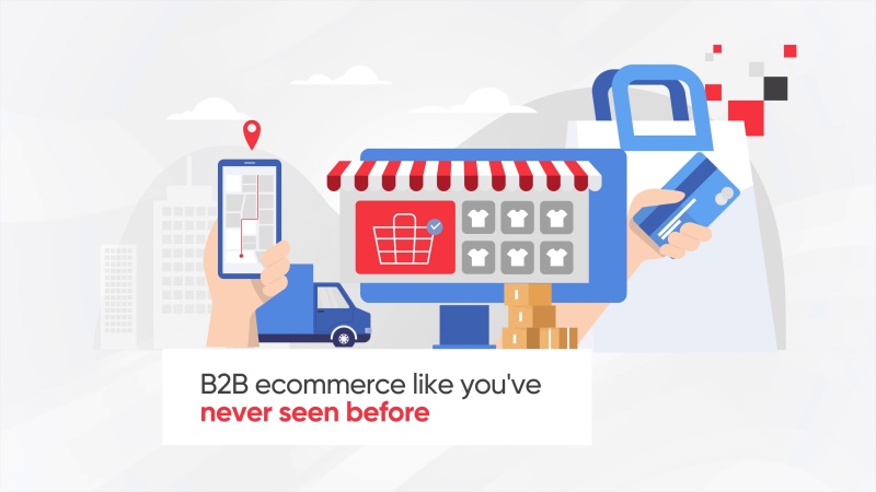
It’s okay that a lot of websites look similar
- By Nick Wearing
- Company News
- 0 Comments
- Posted at 11:27 am
- Share This Post
It’s likely that you have realised by now that a lot of websites out there all look rather similar. You may initially think that this is a potential problem. How can your website stand out when there are potentially hundreds more out there that are virtually identical?
The answer is no. It’s completely fine; and here’s why.
Across the past half-decade, various common trends have emerged in web design: A full width website, large and vibrant banner, large centred text on the header with the logo on the left and a “hamburger” navigation button on the right.
This description might fit your website, our website or many, many other modern designs out there from blogs to large corporate sites – and this is actually quite important. A User has an expectation of any website that they visit. These design patterns have evolved to provide tried and tested controls and function that meet the expectations of users.
This layout is now very recognisable and familiar – and this makes users comfortable using it. Breaking from the norm can potentially frustrate people if they can’t instantly see how to navigate your website. How many times have you been thrown off by finding that rare website with a side navigation?
It does pose a problem for web designers though. As creative minds we want to innovate and create vibrant new designs for each site we work on, but ultimately the end user expectations must always be taken into consideration. This brings us back to the same tried and tested working formula.
How did this happen?
There are quite a few contributing factors as to why this has happened – from the modern responsive to design to HTML5 video with the interest in simplistic flat design. The technology has evolved to make it easier than ever to build more appealing, creative and interactive websites. Although this is also what has driven us towards this standardised layout.
With the rapid increase in the amount of devices being used to browse the World Wide Web, designers need to get the most out of all of them to ensure that the browsing experience is optimal no matter if on a 4 inch mobile or a 40 inch television.
Another evolution that is a contributing factor is the rise of powerful of front end frameworks. Each one comes with its own pre-designed text, buttons forms and media queries. A significant amount of designers and developers now rely on these frameworks from large commercial to personal projects. There’s no need to ‘re-intent the wheel’ by building a website entirely from scratch for every client. The reduced time and therefore cost to create sites can also be passed on.
There are also a plethora of templates and themes available to be used for all of the major frameworks to meet many different design needs – with these, designers can now build websites with very little knowledge of web development required.
It’s all fine
So no it’s not a problem to be concerned about similar websites. It’s simply a symptom of the fantastic resources we have available to us. It’s not even a problem of stifled innovation – with the tools available, we can focus on reaching the maximum capabilities of devices. Creating a website that simply meets the trend isn’t good enough – designers should use their creativity to build not just websites – but experiences. All while keeping the tried and tested look.
Developer
Although Nick only has only been in the web design industry for a couple of years, he quickly became a valuable member of the Nexus Websites team.