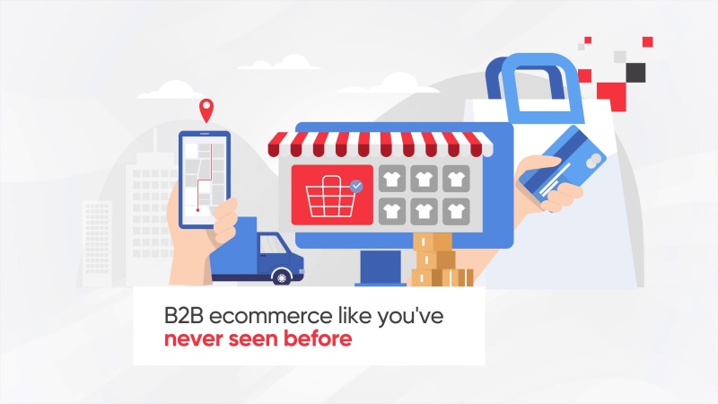
Flexible Web Design
- By nexusadmin
- Company News
- 0 Comments
- Posted at 8:47 pm
- Share This Post
Until fairly recently, web design used to be pretty straightforward. A standard desktop pc monitor was a defined size and shape and as long as a design fell within certain parameters, you were okay.
Things are significantly different these days, however. Rather than be tied to a desktop pc if you want to access the web, consumers can now surf from wherever they happen to be at the time via a huge range of devices of completely differing size and resolution. This means designers can no longer provide a neat standardised design as they have no idea of knowing beforehand which kind of device a consumer is going to be using. Rather, web designs have to be flexible and adaptable: we call this Responsive Web Design.
Go With The Flow
As a designer, you no longer have any way of knowing in advance what device a consumer is going to be viewing your page on – and there are too many variations out there for you to cater specifically to each one individually.
Try and imagine your design as a fluid shape that will expand, contract and distort dynamically. Think about how the look of the design will change as the size increases or decreases.
For example, it would be unhelpful to state that a website’s header should have a gap of, say, 50 pixels before the content. A big empty space that looks good when designed on a 22” monitor would be hopeless when viewed on the tiny screen of a mobile phone. Instead, that margin should automatically adjust according to the resolution of the browser the website is being viewed on.
To achieve this, web designers are now using percentages, rather than pixels, as these are fully scaleable to any resolution.
Real Responsiveness
A common misconception is that a website being “responsive” means that the layout switches between predetermined sizes depending on which device it is being viewed on, such as three separate designs for ‘mobile’ ‘tablet’ and ‘desktop. To be truly responsive, the design should be built upwards from a flexible foundation that is fully scaleable no matter what resolution is being used.
The advantage of designing like this is that, rather that building designs for pre-set known device resolutions, it will future-proof your design as it will already adapt perfectly on any new devices that come out in the future with different resolutions.
A well designed website can be compared to a liquid. It will reshape and adjust to any container. While it may take more effort to properly implement than a traditional website, it will be well worth it in the long run, as people can see your content exactly as it should no matter what device is being used.
For more information about responsive web design, please get in touch with our Web Design Wigan team today!
nexusadmin
Bespoke Website Design
Established in 2010, Nexus Websites are a creative digital agency based in Wigan working with clients all over the UK. With a vast range of experience and a proven track record we have everything you need to take your business to the next level.